Why does your AI artwork look so good at first glance? AI flavorIt's too heavy, the characters look like soulless dolls, and the scenes are fake like they have ten layers of filters on them.
It's not that. AI It's too stupid, it's our cue words that suck.
Write only a few fixed words like good looking, beautiful, professional, best quality. That's not a cue word, that's a wish.
It's past the time when people don't know anything about AI, and if they use AI to make a beautiful picture, the comment section will be a bunch of 666.
We are gradually moving from the pursuit of beauty to the pursuit of truth. Say goodbye to fake at a glance, and it's vital to enhance the texture of your AI work.
Today we will teach you four tricks to enhance the texture of your images. Let's look at the case first.
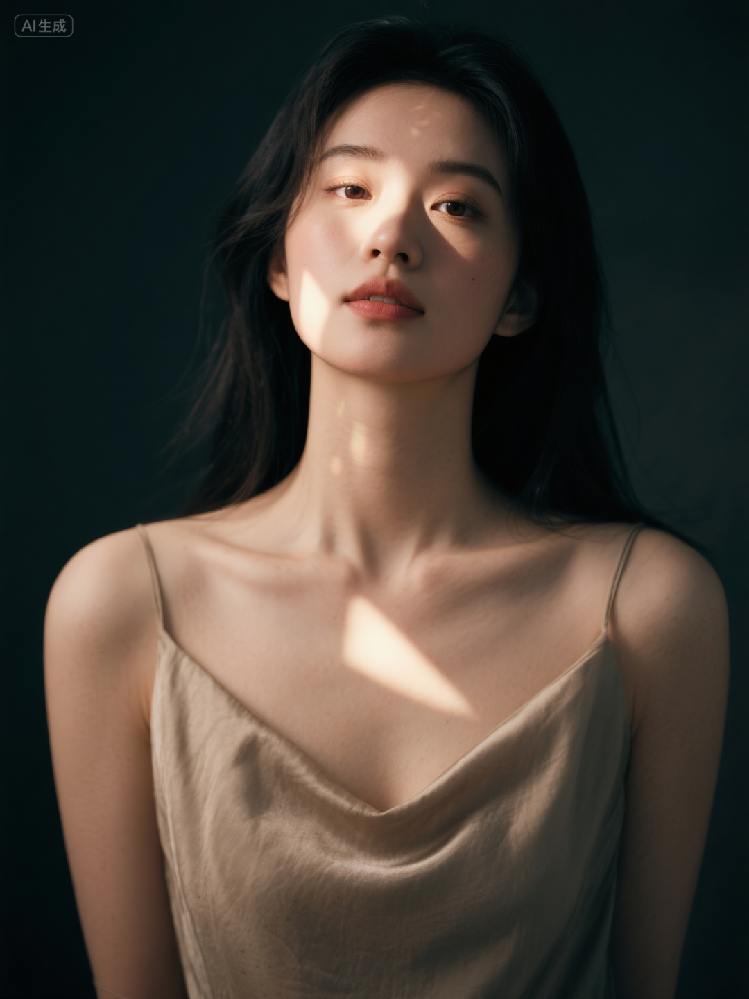

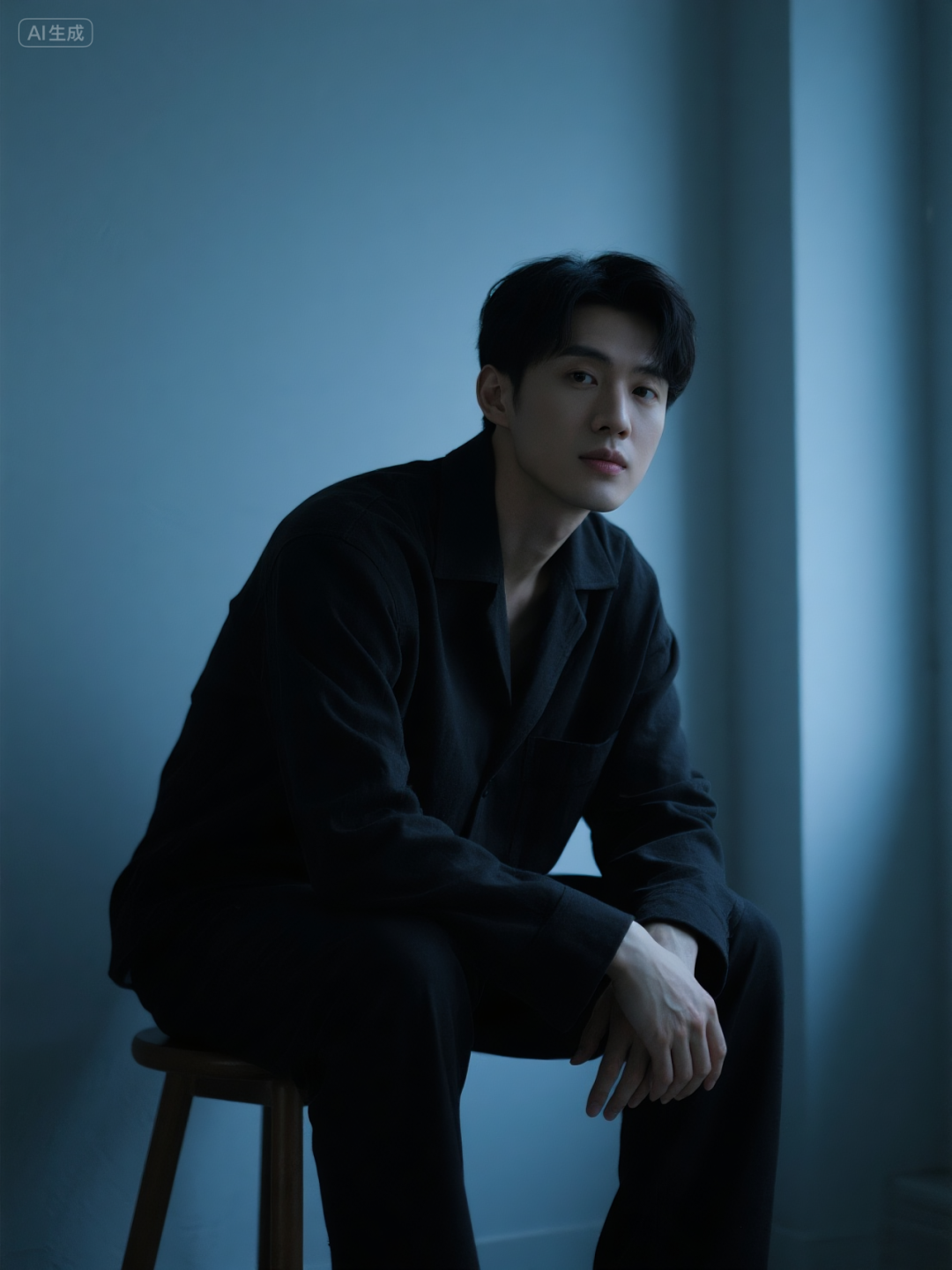
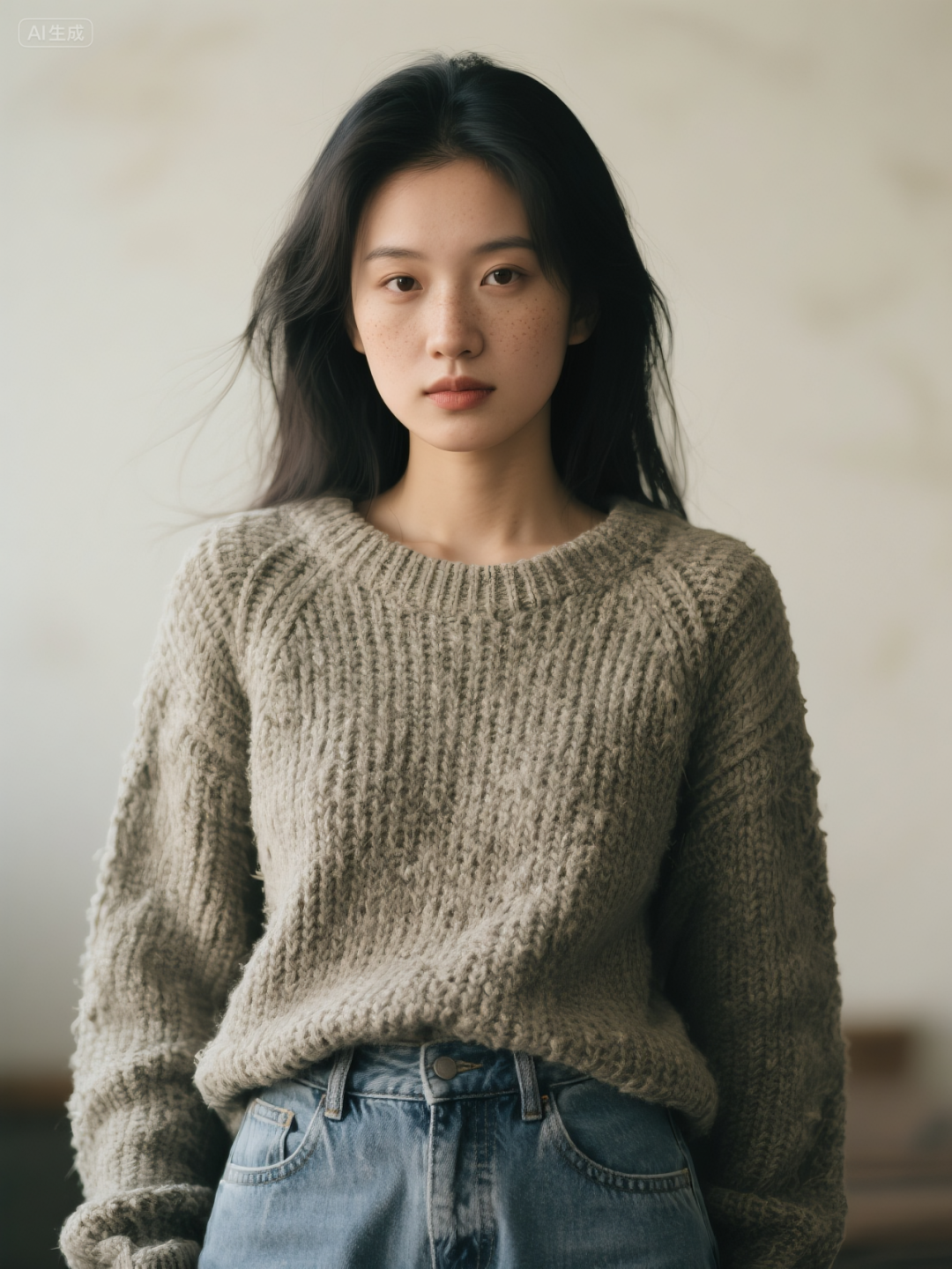
Photography and Lighting
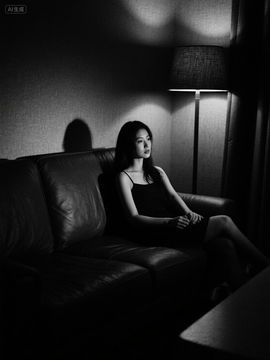
- Instead of writing directly about the bright light, you can write about the Rembrandt light, with triangular patches of light on the cheeks (Figure 1)
camera language
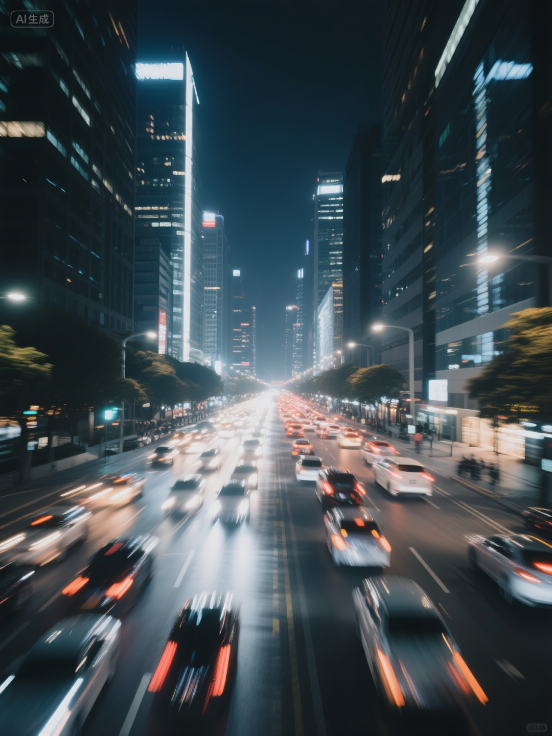
- Instead of writing directly about blurriness, you can write about motion blur, lens vignetting, film grain (Figure 2)
Special Effects
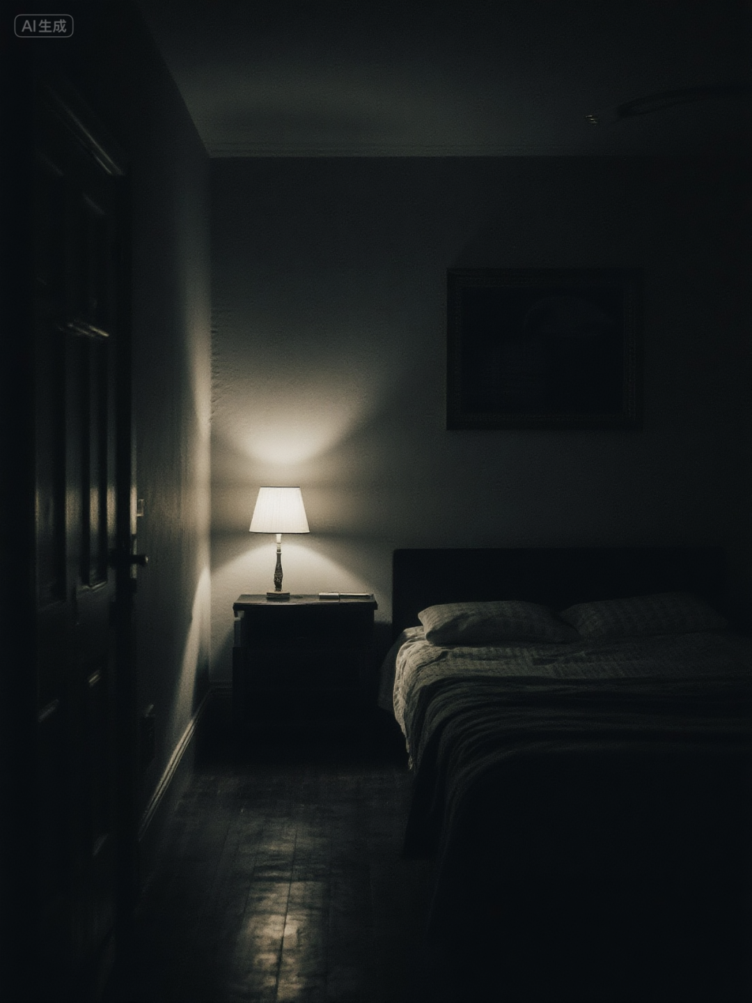
- Instead of writing directly about premium, you can write about volumetric light, dark corners, and slight color differences at the edges (Figure 3)
material (that sth is made of)
- Instead of writing directly about a girl in casual clothes, you can write about a knitted textured sweater, rough canvas jeans, matte skin, and a little freckle on the face (Figure 4)
We first need to understand what they represent in the visual arts, and then we can readily think of and use them when writing prompts.
The three paths are explained in more detail below, and I'll also give some better quality words for ease of use at the end.
one,Photography and Lighting
There are two parts to this, photography (how the camera sees the world) and lighting (how light shapes the world).
photography
Photography is all about controlling the light that enters the camera, i.e. exposure. It relies on three elements: aperture, shutter speed, and sensitivity ISO.
1. Aperture
Aperture is the control of how much light enters the camera. It is expressed as an f-number, such as f/1.8, f/4, f/16.
We often see these words in some prompts, but there is really only one rule.
The smaller the f-number, the larger the aperture, the more light enters and the brighter the picture.
The larger the f-number, the smaller the aperture, the less light enters and the darker the picture.
- Deepen your understanding: Think of the aperture as a pupil. The darker it is outside, the larger the pupil (aperture) is, and the more light you open your eyes to receive. The brighter it is, the smaller the pupil is and the less light you squint.
There is a concept that will be introduced here, depth of field.
A small f-number produces a shallow depth of field. The focused subject is sharp and the background and foreground are blurred, making it ideal for portraits.


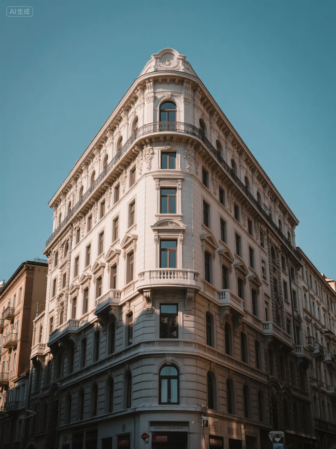
A large f-number that produces a large depth of field. Sharp from foreground to background, suitable for panoramic shots (landscapes, architecture, etc.).

quick reference value
- f/1.4, suitable for portraits, dark light environment, starry sky, the picture is more dreamy.
- f/2.8 for portraits, events, indoor sports and more.
- f/5.6 for everyday snapshots, group photos, etc.
- f/8 for landscape, architecture, street photography .
- f/16, macro photography.
- f/22, long exposures (e.g., shooting silky water flow), extreme depth of field, etc.
2. Shutter speed
Shutter can be simply understood as the speed of switching, which determines the length of time the light strikes. It is expressed in seconds or fractions of a second, e.g. 1/1000s, 1/60s, 2s.
The faster the shutter speed, the shorter the incoming light, and the darker the picture will be.
Ideal for shooting frozen moments and capturing high-speed movement such as flying birds, running athletes, etc.

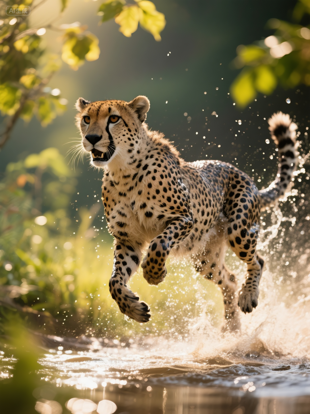
The slower the shutter speed, the longer the incoming light, the brighter the picture will be.
Motion blur is produced, and moving objects leave tracks on the screen. Ideal for shooting traffic, silky water flow, etc.

3、Sensitivity ISO
Sensitivity is how sensitive the camera sensor is to light. Values such as ISO 100, ISO 800, ISO 6400.
The lower the ISO, the lower the sensitivity, the purer the image and the best detail. Suitable for use in well-lit environments.
The higher the ISO, the more sensitive it is, allowing for bright photos in very dark conditions.
Here too, a concept is introduced, noise. Or called graininess.
A high ISO will increase picture noise and degrade picture quality with stray color grain. However, the right amount of grain can mimic the effect of film, which can be quite vintage instead.
So generating portraits with a film grain works sometimes very, very well.
illumination
Light is the soul of a picture; without light there is no image. Light determines the atmosphere, three-dimensionality and texture of the picture.
1. The nature of light
There are hard and soft lights.
Hard light comes from small but strong light sources, such as the midday sun, flash bare light.
Hard light will have light and dark, clear and sharp shadows. Just as things are always more distinct when viewed in sunlight, the outlines and surface texture of objects are more defined, more dramatic and powerful.


Soft light comes from large, diffuse sources, such as the sky on cloudy days, light through window screens in daytime interiors, and soft lights.
There will be blurred and soft, smooth transitioning shadows. The light is even, which beautifies the skin and makes it appear gentler, calmer and more beautiful.
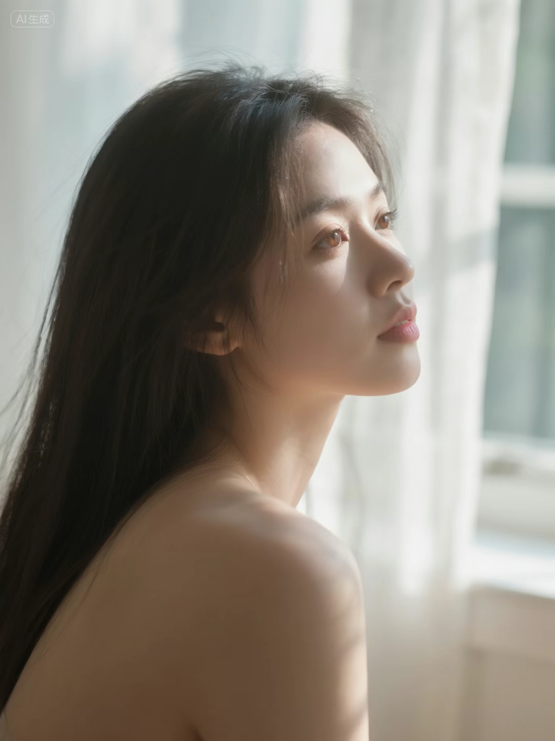

2. Direction of light
Where the light comes from determines where the object is illuminated and where the shadow is placed.
There are mainly smooth light / front light (front exposure), left / right side light (side exposure at 90 degrees), side reverse light / profile light (rear or side rear exposure), top light (top exposure), bottom light (bottom exposure), etc.
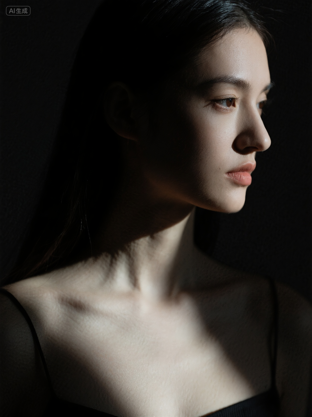
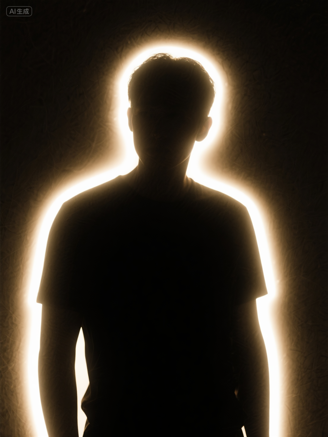
(Left: Side light. (Right: rim light)
II. Language of the camera
Photographic lighting favors static images, while the language of the camera is all about making the image move.
It's like a graphic born video, from a picture, to a story moment. It can better guide the viewer's eyes and emotions.
It is mainly categorized into lens field of view, camera angle, camera movement and so on.
III. Special effects
Special effects are the means by which photography is taken to its limits, and even beyond. There are live action effects, as well as post-production effects.
But with AI, we can invoke these techniques, which can be called magic, directly using cue words.
1. Optical atmosphere
Unlike the light mentioned above, optical ambience focuses more on some physical phenomena in reality and is used to add a sense of real atmosphere to the picture.
for example:
Lens halos, the spots and halos created when strong light hits the lens directly. Adds a sense of realism. (Figure 1)
Chromatic aberration, colored inlays of purple, green, etc. appear on the edges of objects. Adds a vintage feel and simulates imperfections. (Figure 2)
Volume light, beams of light formed by light passing through dust, fog, etc. Adds mystery and layers. (Figure 3)
Motion blur, as mentioned earlier, is a blurring effect created by fast moving objects. Adds a sense of speed.

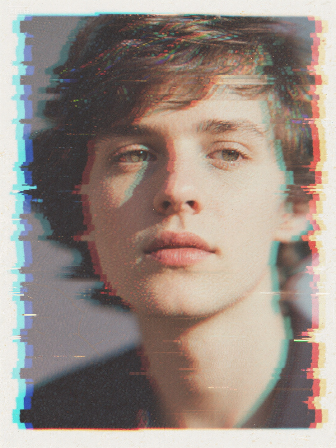
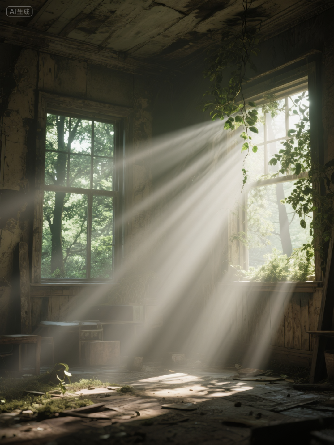
2、Stylized post-effects
Movie color palette, unified visual style and emotional tone. For example, cold tones are used for sadness, and warm tones are used for warmth and nostalgia. (Figure 1)
Film grain, as mentioned earlier, adds a vintage feel. (Figure 2)
Dark corners, darker all around than in the center, adding a sense of depression, etc. (Figure 3)
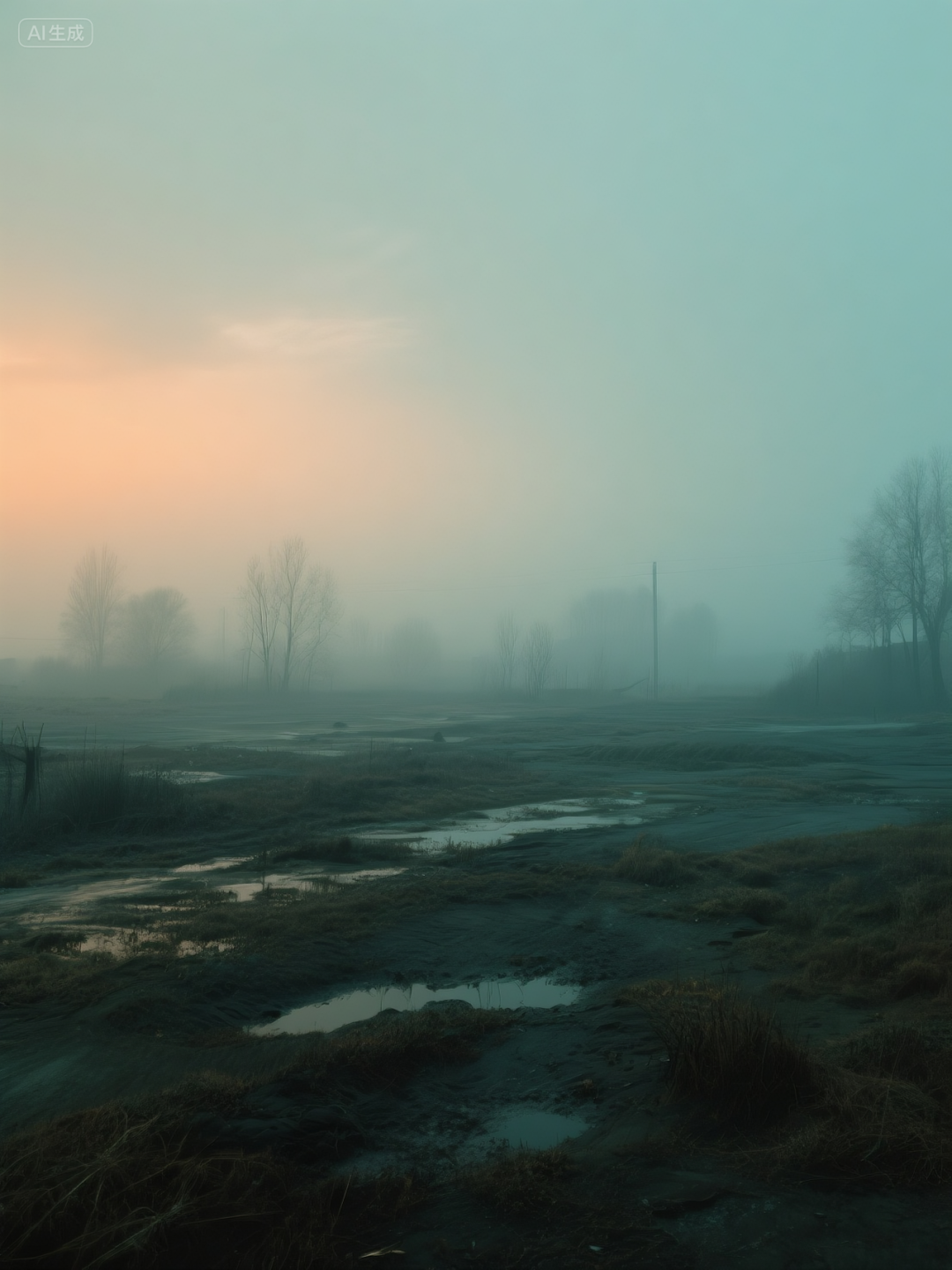


IV. Material
This part is crucial. Let's look at an example first.
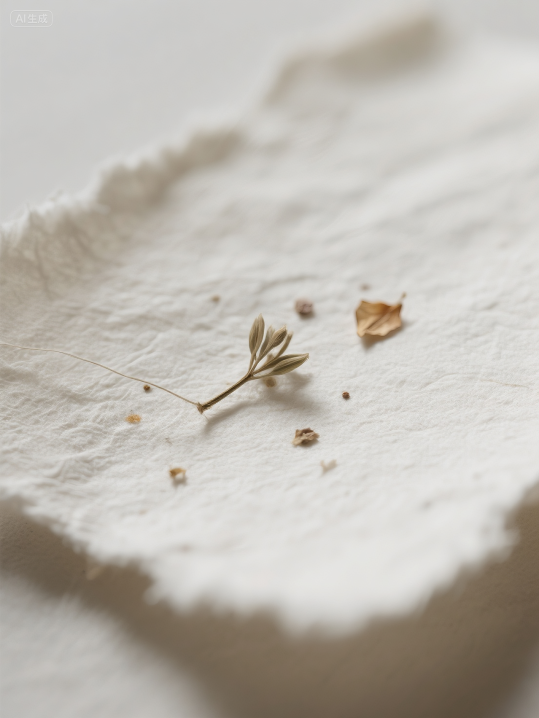

The easiest way to describe the surface of an object is to use very specific, subjectively experienced words.
Here I've compiled a vocabulary of some of the different types of materials to make it easier for you to use them directly.
1. Skin
Young/Idealized.
- smooth dewy skin - emphasizes shine and moisture.
- porcelain skin - the ultimate in smoothness and flawlessness.
- glowing, radiant skin - with a healthy glow.
- soft, peachy skin - emphasizes fluffiness and softness.
True/Aged.
- weathered, wrinkled skin - full of stories.
- leathery skin texture - roughness caused by sun exposure, etc.
- visible pores, realistic skin texture (可见的毛孔,真实的皮肤纹理) - Pursuing hyper-realism.
- freckled skin - adds character and realism.
Special Status.
- sweaty, glistening skin - expresses heat or tension.
- oily skin with specular highlights - emphasizes shine.
- goosebumps on skin - conveying cold or fear.
- skin with wet droplets - just out of the shower or in the rain.
2. Fabric/textile
Soft/Comfortable.
- soft knitted wool - has a crisp woven texture.
- fluffy cashmere sweater.
- wrinkled linen shirt(wrinkled linen shirt) - Linen is characterized by its wrinkles, which are naturally casual.
- worn-out denim - with fading and raw edges for a vintage feel.
Luxury/Smooth.
- lustrous silk dress - emphasizes its smoothness and highlights reflections.
- rich velvet curtain - absorbs light and has a deep feel.
- delicate lace - with intricate openwork patterns.
- shiny satin - Reflective and stiff.
Functional/Modern.
- technical nylon fabric - slightly reflective and water resistant.
- sheer, transparent organza - creates layers.
- heavy canvas - rough, hard-wearing.
3. Metal
Smooth/Brand New.
- highly reflective chrome - Mirror effect.
- brushed aluminum - has fine parallel scratches and soft reflections.
- polished gold - a smooth, warm reflection.
- anodized metal - with matte color coating.
-galvanized steel - has a unique zinc pattern.
Rough/stale.
rusty cast iron - having a rough, reddish-brown rusty surface.
- tarnished silver - blackened by oxidation of the surface.
- dented and scratched steel - full of signs of battle or use.
- patinated bronze statue - green oxidized surface.
- hammered copper - having irregular hammer mark indentations on the surface.
4. Timber
- polished mahogany wood - Fine grain and mirror-smooth surface.
- light oak with clear grain.
- lacquered wood - having a thick, smooth protective coating.
- rough, splintered wood.
-weathered driftwood (weathered driftwood) - whitish in color, with a rounded but rough surface washed by water.
- charred wood, burnt texture (烧烧木头,燃烧后的质感).
- bark texture - rough, cracked.
5. Glass
- crystal clear glass.
- frosted glass - translucent, scattering light.
- rippled glass - glass that distorts when light passes through it.
- shattered glass - with radiating cracks.
- glass with condensation and water droplets.
6. Liquid
- calm, reflective water surface.
- splashing water with airborne droplets.
- viscous, thick honey - slow flowing, elongated highlights.
- bubbling carbonated drink.
- dynamic paint splash.
The most powerful tip for writing good materials is Material + State.
Don't just say wood, say damp, mossy wood.
Don't just say titanium, say scratchy, futuristic titanium.
Final Thoughts
This article is the result of some of my recent studies and I have benefited a lot from learning it.
After reading this, I believe you also understand one thing, the bottleneck of AI is never AI, but our lack of imagination and expression.
The following quote was written by the AI when I was discussing it with him:
- Stop settling for vague instructions and start thinking like a director, describing like a poet, and observing like an artist.
It's true that even with AI works, the creators are us, not the big models.
Using cue words has to be as precise and elegant as Kenshi.
Cue word before learning: a sad man.
Cue words after learning: movie shot, close-up of a man's face, high angle overhead. Rainy night with water drops on the window panes. Cool tones, low saturation color palette. Slight chromatic aberration at the edges. Shot on 35mm film with visible film grain. The only light source is a flickering neon sign outside the window, casting a soft blue contour light on his cheek.

Go ahead and try these magic spells if you learn them. That's it for today's post, feel free to like and retweet it if it helped you!