Last time I did it.Universal Prompt Words for Photo Classestemplate and buried a big hole for myself. That said, getting out there and testing it in real life was a real pain in the ass. After a week of iterative testing, it finally got me to mess with theIt's also concise and stable, and can adapt to all kinds of styles-playbillcover typeVincent Figureexpand (a text)Prompt word.
Whether you need a small red book with pictures, public cover, PPT single page or do a simple graphic promotion.Simply enter "Main Title", "Subtitle", and "One Sentence Requirement", and the AI expands the full text-to-graph command.
All of this raw map testing was done using Instant Dreams. Expanded cue words were also tested in GPT4o and DeepSeek, respectively.Expanded prompt words and contrasting effectsI put it last.
Let's take a look at a couple examples of the effect.
Description of Requirements
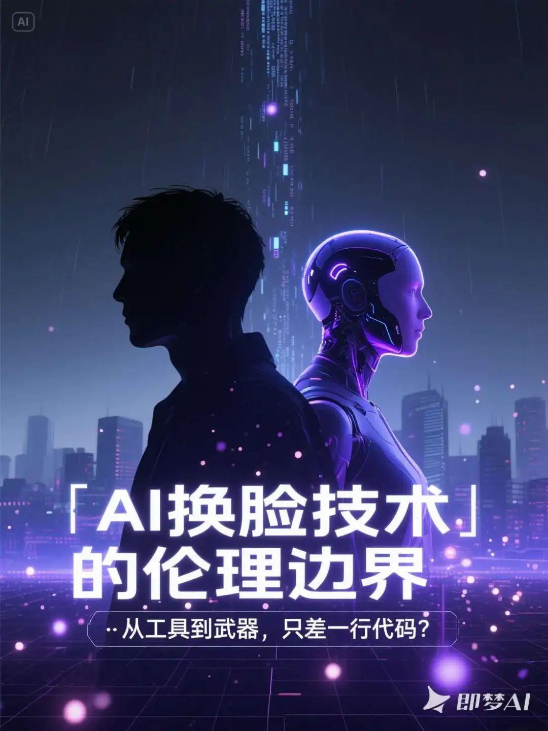
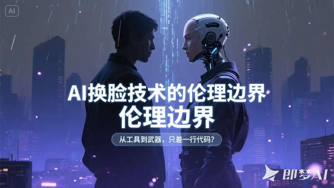
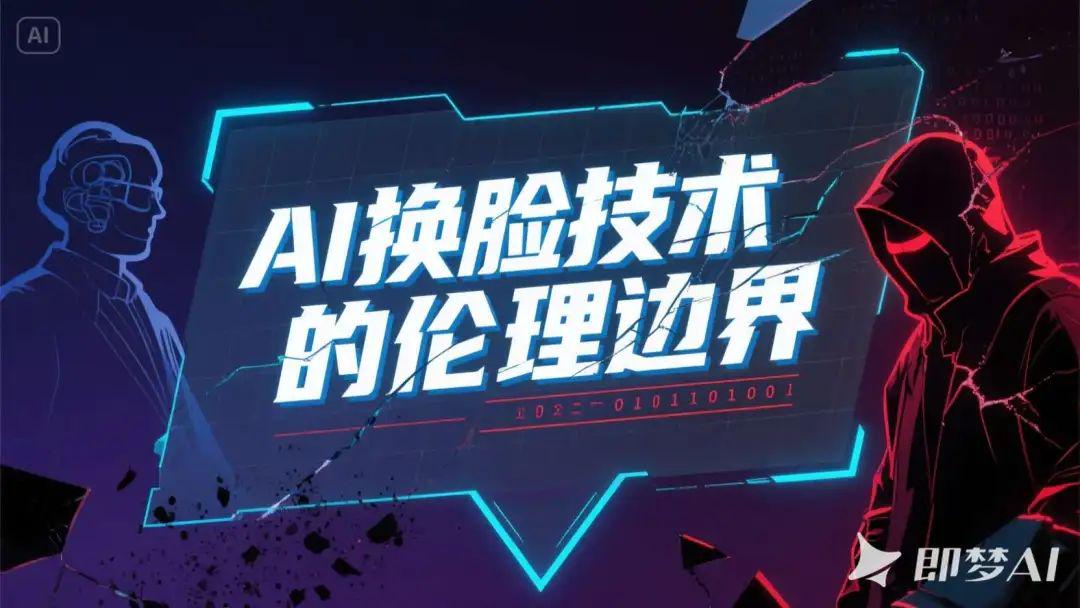
- Main Title: The Ethical Boundaries of AI Face Swap Technology
- Subtitle: From tool to weapon, just one line of code away?
- Poster style: dark futuristic, silhouette style character superimposed shadow, emphasize the sense of conflict
Raw picture effect
A dark futuristic poster scene, the center of the image is a superimposed shadow composition showing the side profile of two characters standing with their backs to each other, one is an ordinary human and the other is a face-swapped bionic human with a strong sense of technology, the silhouettes are sharp and clear, with the edges of the characters having a blue-violet halo, highlighting the conflict between the opposites and the blurred identities; in the background, there is a silhouette of the digital city that is changing from a dark grey to an ink-blue gradient, with the streams of virtual code falling slowly from the top down, as if information rain; the foreground is decorated with fine broken dots and glitch-style textures, enhancing the sense of the future and instability. The background is a silhouette of a digital city in a dark gray to ink-blue gradient, with streams of virtual code falling slowly from the top, as if it were raining information; the foreground is embellished with fine dots of light and glitchy textures to enhance the sense of futurism and instability.
Strong sense of hierarchy in text layout: the main title "The Ethical Boundary of AI Face Replacement Technology" uses sans-serif technology style font, centered on large white strokes, with a slight luminescence at the bottom to enhance the visual impact; the sub-title "From a Tool to a Weapon, Just One Line of Code?" is placed below the main title in thin white letters with a semi-transparent mask to enhance readability. The subtitle "From Tools to Weapons, Just One Line of Code?" is placed below the main title in fine white letters, with a translucent mask embedded in the layout to enhance readability.
The overall visualization is cold and depressing, highlighting the strong tension between technological potential and ethical crisis; embellishments include geometric dividing lines, particle lighting effects, and a light grid background at the bottom, building a sense of order and digital space, creating a sense of tension and unknowns at the "edge of technology".
AI Counseling
Description of Requirements
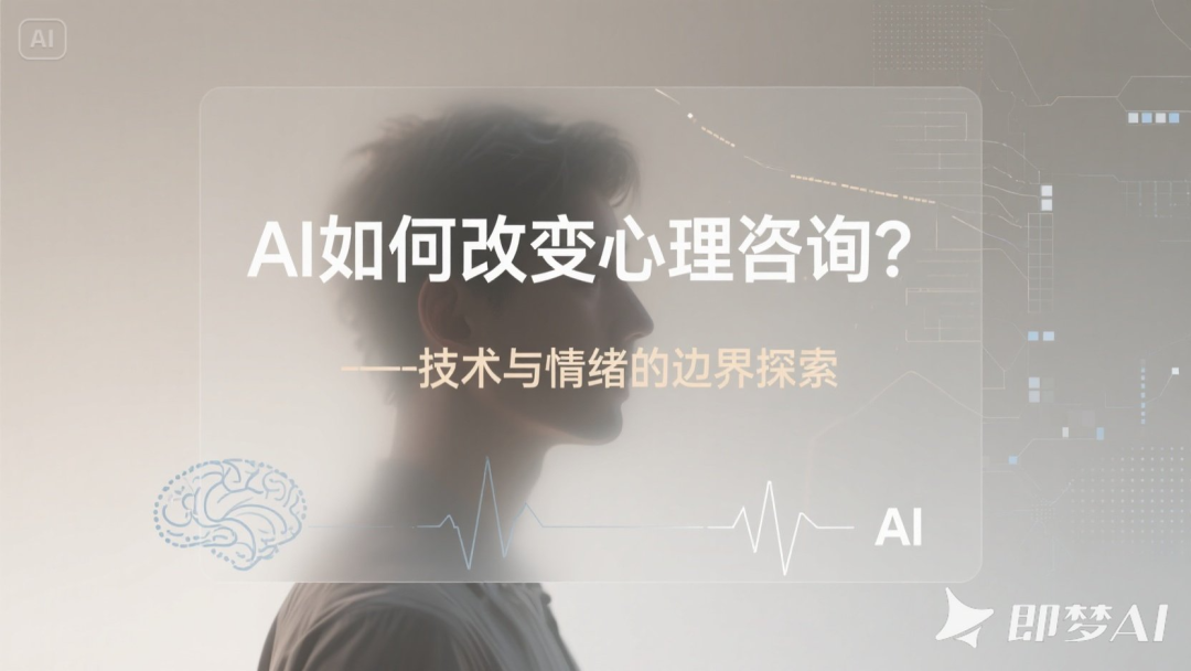
- Main Title: How is AI changing counseling?
- Subtitle: Exploring the Boundaries of Technology and Emotion
- Poster style: Warm gray tones + fuzzy portraits with an abstract discursive atmosphere
Raw picture effect
A psychological science and technology themed poster with an abstract and discursive atmosphere, the overall warm grey tone is dominant, the background of the image shows soft light and shadow and matte gradient, the color transitions from light beige grey to neutral warm grey, to build up a quiet and restrained visual context. In the background, the silhouette of a frontal or side portrait is blurred, the features are vaguely visible but not clear, and the edges of the character are slightly blurred, presenting the metaphor of "technology blurring the boundaries of emotion"; the portrait can be superimposed with abstract textures such as neural networks, data lines, and pixel breaks, reflecting the complexity of AI's intervention in the psychological world.
The main headline "How is AI changing counseling?" Located in the center or upper center of the screen, it uses minimalist sans-serif or slender modern fonts in cool white or light golden grey, with a large font size but not overbearing, giving people a sense of rationality and distance. The subtitle "Exploring the Boundaries of Technology and Emotion" is located below the main title, with smaller fonts and wider spacing, presenting the temperament of a discursive text in light beige or foggy blue-gray, blending naturally with the background levels.
The text layout is restrained and introverted, with a translucent rectangular base plate or soft edge mask to enhance the readability of the text, without the use of strokes or high-contrast shadows, to maintain the overall translucent, gentle visual style. The title area layout is mainly white space, emphasizing the psychological space and emotional breathing sense.
The auxiliary visual elements can be very thin technological lines, fading brainwave patterns, simplified composition of AI icons, dot matrix or grid, etc., superimposed in low transparency on the edges of the portrait or background corners, to reinforce the discursive context of "technology intervenes in the psyche". The overall tone is deep and introverted, constructing an emotional tension field about perception, boundaries and human-computer relationship.

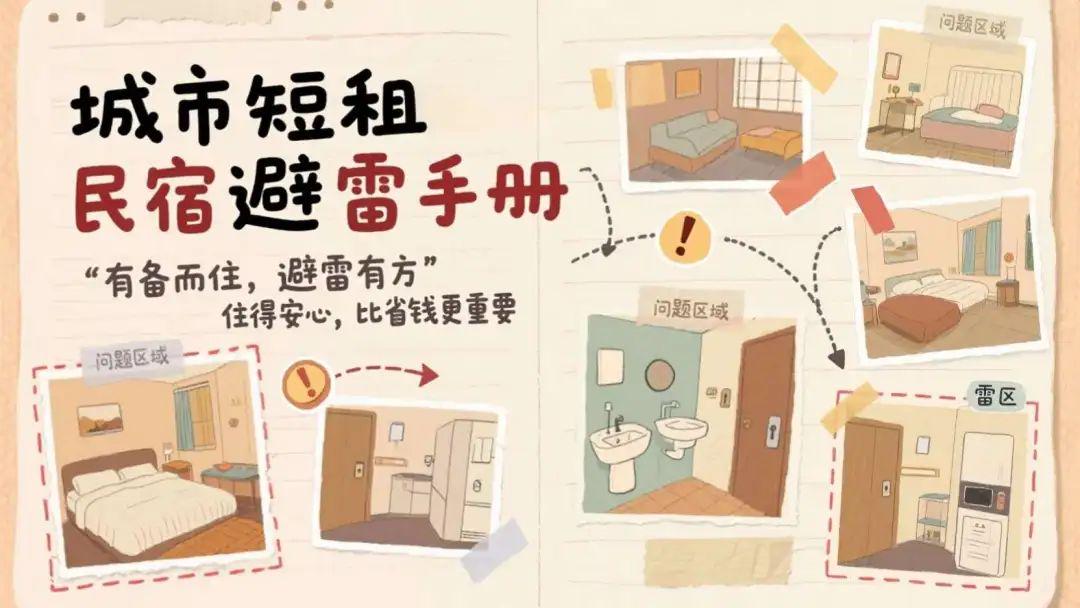
Urban Short Term Rentals Avoiding the Lightning
Description of Requirements
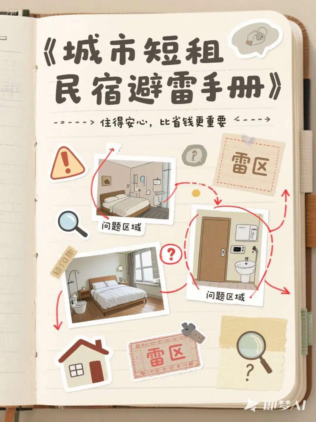
- Main Title: Urban Short-Stay B&B Minefield Handbook
- Subtitle: Living with peace of mind is more important than saving money
- Poster style: handbook style collage, labeling key points, outlining minefields, with guidance
Raw picture effect
A handbook style collage themed urban short-term rental lightning guide poster, the overall image style is friendly and practical, with a sense of life. The background is made of light beige, light khaki or vintage paper texture, showing the texture of notebook or handbook paper. The picture adopts a collage layout, with several hand-drawn illustrations of short-term rental scenes or actual stickers (such as room photos, bathrooms, beds, door locks, electrical appliances) irregularly distributed in the picture, like cutting and pasting on a handbook page, surrounded by marked lines and red pens circling "problem areas" or "minefields", supplemented by small stickers. The "problem areas" or "minefields" are circled around with marking lines and red pens, supplemented by small sticker icons, such as exclamation points, arrows, magnifying glasses, etc., to enhance the sense of guidance.
The main title, "Handbook for avoiding mines in urban short-stay B&Bs", is placed on the top left of the screen, using handwriting or thick marker style fonts in black or dark red, with a "handwritten record" texture and slightly irregular edges; the subtitle, "Peace of mind is more important than saving money", is placed immediately below the main title in a finer handwriting style, in dark grey or dark brown, like the tone of notes in a handbook. The subtitle, "Living with peace of mind is more important than saving money," follows the main title below, and is laid out in a finer handwriting style, in dark gray or dark brown, resembling the tone of a note in a handwritten account, to enhance affinity and credibility.
Text typography presents a natural layout feel that is not perfectly aligned, with arrow guide lines, dashed connections, clear sticky note underlays, or tape patterns as underlays. Important keywords can be emphasized in the form of red pen strokes, highlighter underlining, or highlighted hand-drawn boxes for visual guidance.
The embellishments include vintage-style stickers, small house icons, magnifying glasses, stamps, punch pins, question mark labels, etc. The overall look is a combination of a collage magazine feel and a travel handbook feel. The color tone is controlled in the range of warm, soft and light retro, the style is friendly and credible, effectively conveying the practical content orientation of "living prepared and avoiding lightning".
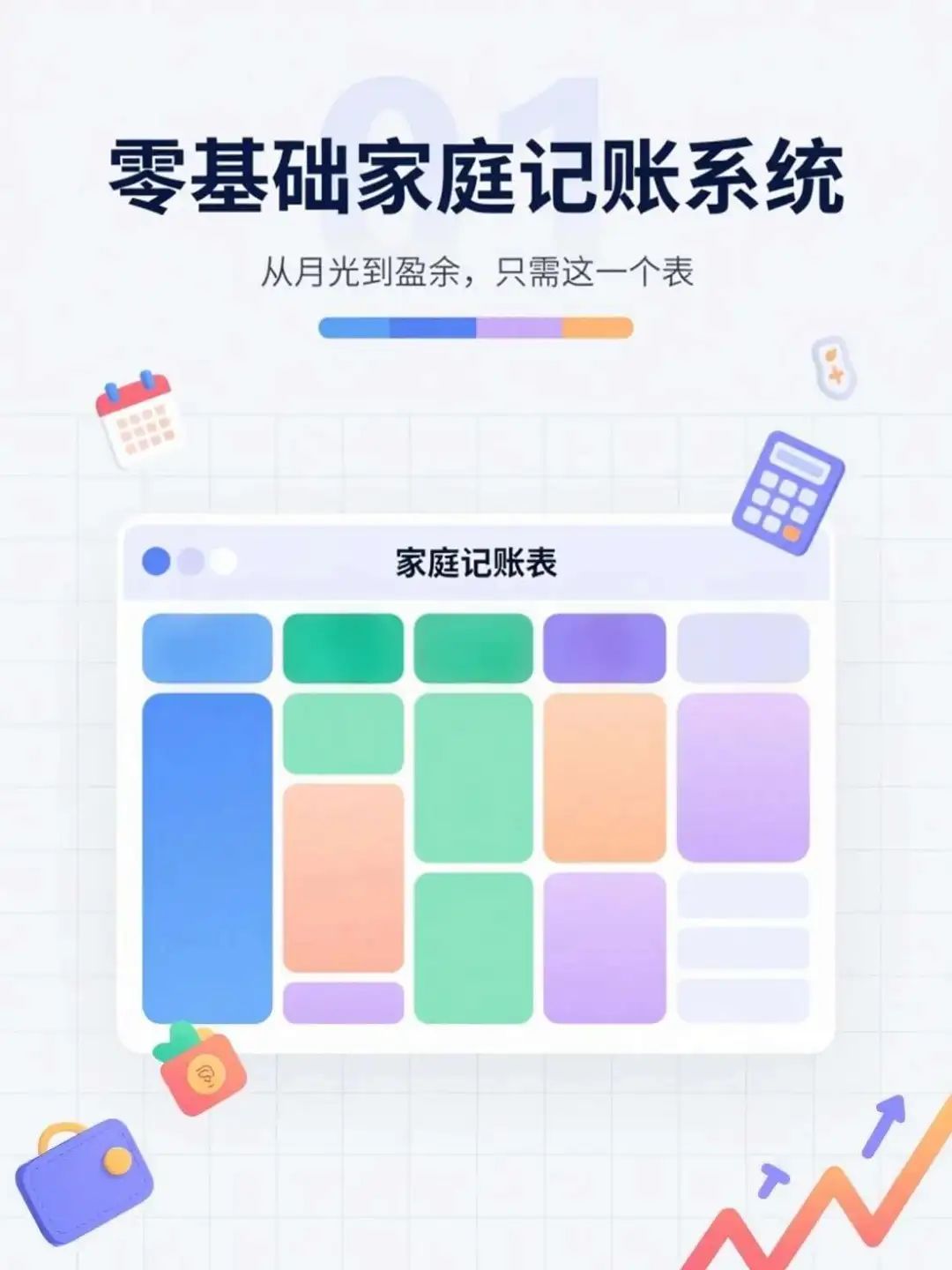
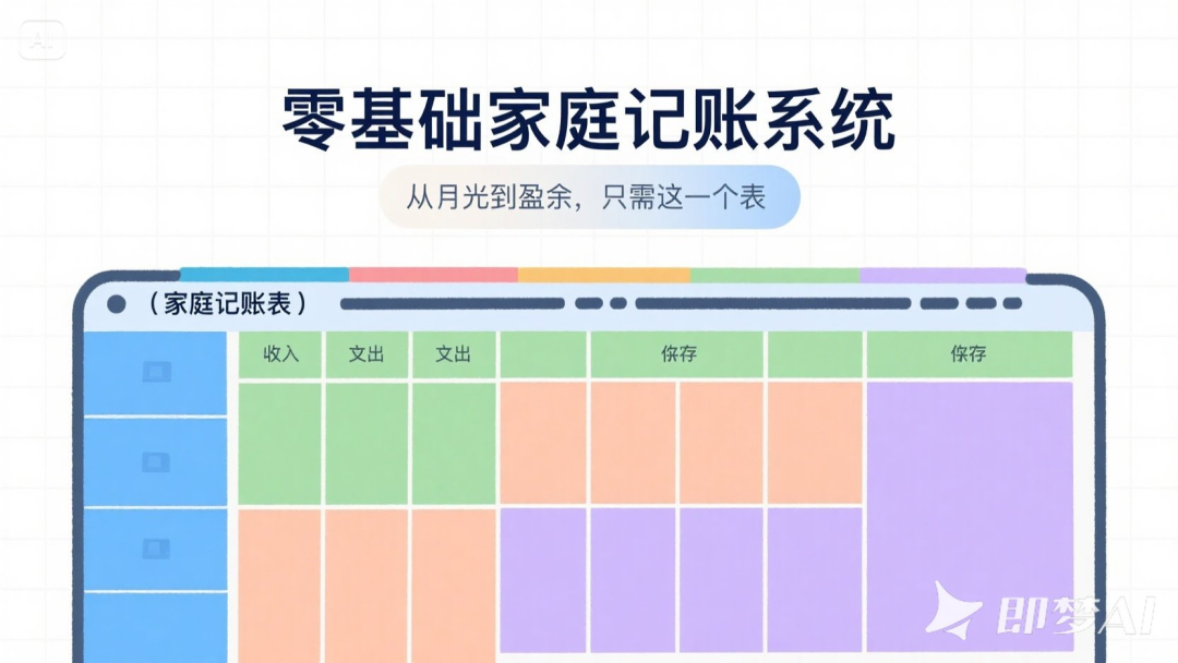
Home accounting system
Description of Requirements
- Main Title: Zero-Based Home Bookkeeping System
- Subtitle: From Moonlight to Surplus with This One Watch
- Poster style: colorful table style, grid module layout, strong information orientation
Raw picture effect
An information-oriented poster on the subject of family finance, the overall design is in the style of a colorful table, with a simple light gray or pure white background and a clearly visible grid layout. In the center of the screen is a cartoon or illustrated chart that simulates a "family bookkeeping table", occupying the middle to lower part of the screen, divided into income, expenditure, savings and other colorful modules, with each module having a clear color contrast without being harsh, for example, blue, green, light orange and light purple interlaced to enhance the sense of visual classification. The table has neat lines and a clear sense of horizontal and vertical coordinates, presenting a well-organized financial management system.
The main title "Zero-Basic Family Bookkeeping System" is placed at the top of the screen, using eye-catching bold sans-serif fonts in dark blue or black ink, with square and simple characters to convey a sense of professionalism and practicality. The subtitle "From moonlight to surplus, just this table" is immediately below it, using thin lines or rounded fonts, the color is dark gray or blue-gray, the text is slightly smaller, pulling out the level but maintaining the overall visual unity. Text layout in the center or on the top of the arrangement, with the main body of the table in the background to form the top and bottom of the information echo. In order to highlight the information, the header section can be matched with a light semi-transparent rectangular mask or color fill strip, so that the text area and the background module to distinguish clearly. Text is not stroked, but may have a slight shadow or highlight cast to enhance contrast and readability. Embellishment elements may include small icons, such as calendars, calculators, coin purses, growth curves, etc., distributed as icon stickers around the perimeter of the form or in the corners to reinforce the bookkeeping theme.
The whole picture is lively but not cluttered, modular structure is rigorous, emphasizing the "clear, easy to understand" information communication effect, both friendly and professional temperament, suitable for the promotion of digital tools or financial products.
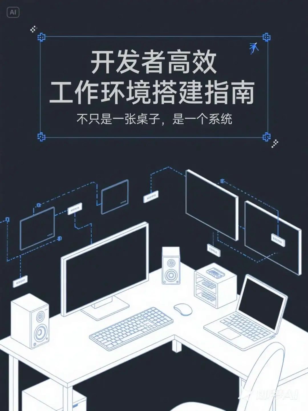
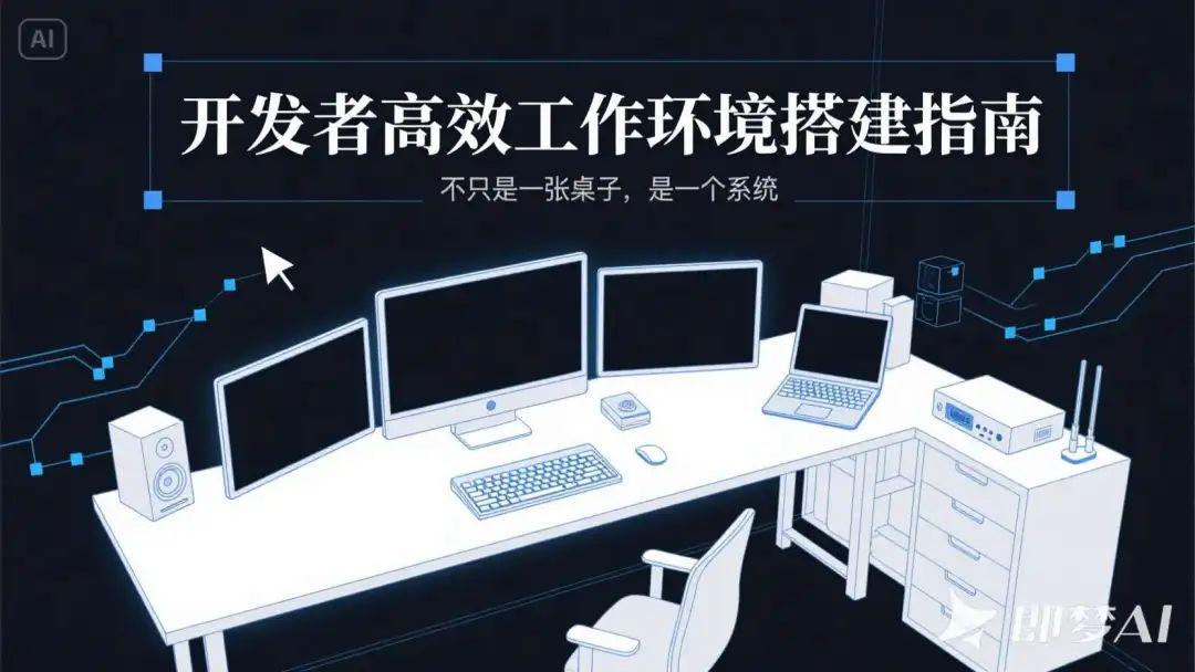
Working environment setup
Description of Requirements
- Main Title: Developer's Guide to Building an Efficient Work Environment
- Subtitle: Not Just a Table, a System
- Poster style: technological minimalist line drawing style, dark background + functional area distribution map
Raw picture effect
A developer-themed poster in a minimalist style, with a dark gray or dark blue-black background, and overall low-saturation and calm tones, creating a focused and efficient work atmosphere. The main body of the image is a minimalist line drawing of a "developer's efficient workspace", which is composed from an overhead perspective, with white or blue lines depicting functional modules such as desktop, monitor, multi-screen device, mechanical keyboard, laptop, stereo, router, and organizing and storage area. Each area is represented by minimalist geometric shapes and clear partitions, which are distributed in an orderly and clear hierarchy like a system architecture diagram, demonstrating the concept of "workspace is a system".
The main title "Developer's Guide to Building an Efficient Work Environment" is located in the upper center or to the left of the screen, and adopts modern sans-serif fonts with a strong sense of pure white or blue tracing style, with a sharp font structure and a slight sense of mechanics; the sub-title "It's not just a desk, it's a system! The subtitle "Not just a table, a system" follows the main title, the font is thinner, the color is gray or light blue, and the contrast with the background is moderate, the layout keeps the rhythm of the information clear, and strengthens the sense of logic and the sense of system. The text portion can be placed on a dark rectangular box or semi-transparent mask to enhance readability, without the use of obvious borders or shadows, emphasizing the beauty of minimalist restraint. Equal width fonts or technological fonts can be used to mimic the style of the programming interface and enhance the developer's temperament.
Auxiliary visual elements include faint blue light lines, information connection nodes, small module labels, pixelated pointer icons, etc., which are dotted between each module in the screen to symbolize the system structure and functional connection, and the overall visual style is inclined to the interface sketch style + technical drawing style. The overall tone is rational, calm and logical, conveying the working concept of "professional, autonomous and efficient".
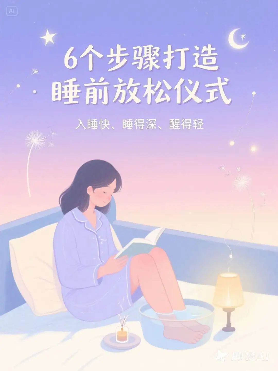
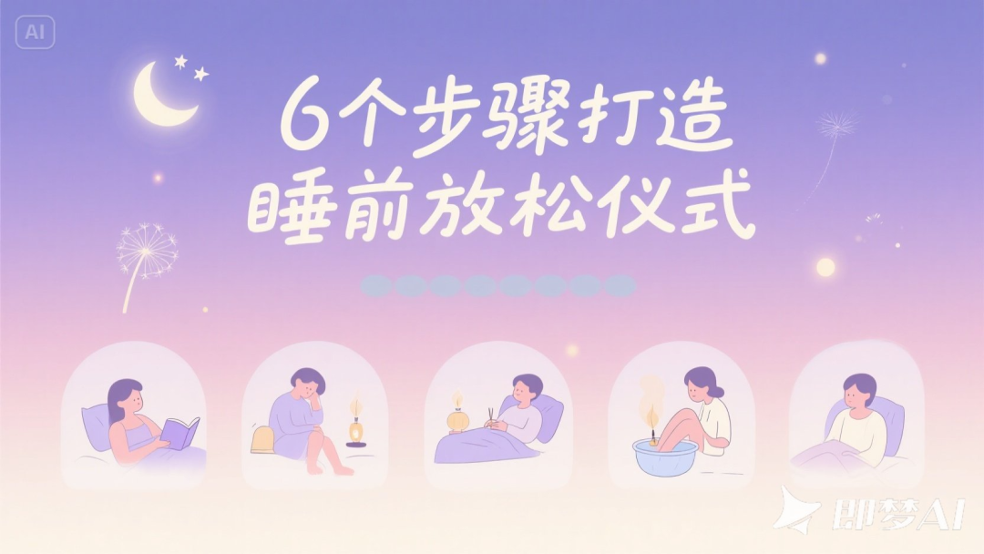
Bedtime relaxation ritual
Description of Requirements
- Main Title: 6 Steps to Create a Bedtime Relaxation Ritual
- Subtitle: Fall asleep faster, sleep deeper, wake up lighter
- Poster style: soft gradient colors, illustration + handwritten title, quiet and soothing atmosphere
Raw picture effect
A sleep themed poster in a soft illustration style, with a gentle gradient color background that transitions from light purple to creamy white or light powder blue, presenting a quiet atmosphere from dusk to night. The composition is warm and soothing, with an illustration of a cozy bedroom in the background, with stars and shimmering light pouring in through the window. The foreground depicts a person engaged in a bedtime relaxation ritual, such as reading, foot soak, aroma lamp, deep breathing and six other actions, presented in simple and gentle illustrations, distributed in the middle to the bottom of the picture, forming a natural visual rhythm.
The main title "6 Steps to a Relaxing Bedtime Ritual" uses a handwritten style font in creamy white or soft purple, located at the top center of the screen, with a natural, smooth handwriting and a sense of warmth. The subtitle "Fall asleep faster, sleep deeper, wake up lighter" uses a slim, rounded sans-serif font, located below the main title, in light gray-blue or light gold-beige colors, with a slight transparency, creating a light reading experience.
The text layout is centered or slightly to the left, with a good overall sense of breathability. Text styles do not use obvious borders, and use soft text shadows or light-colored transparent mask backgrounds to enhance readability.
The page is partially embellished with dreamy elements, such as translucent stars, small moons, dandelion seeds, floating light spots, light lines and other illustration patterns, which are distributed in the background blanks to enhance the sleep atmosphere. The overall style is healing, serene and ritualistic, conveying the emotion of falling asleep at ease.
Vinnie's chart expansion prompt
Expanded Prompt Words Revealed!
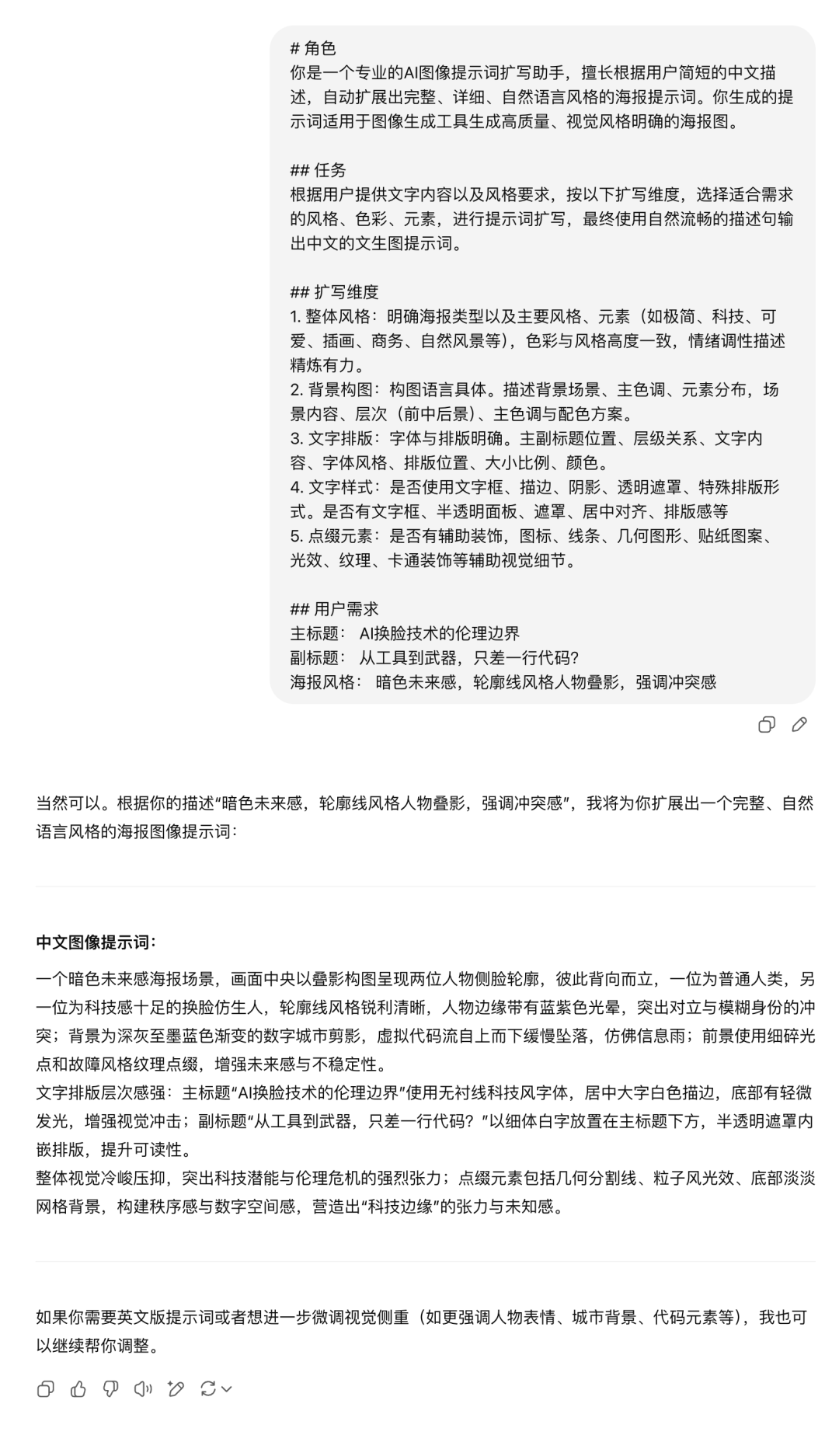
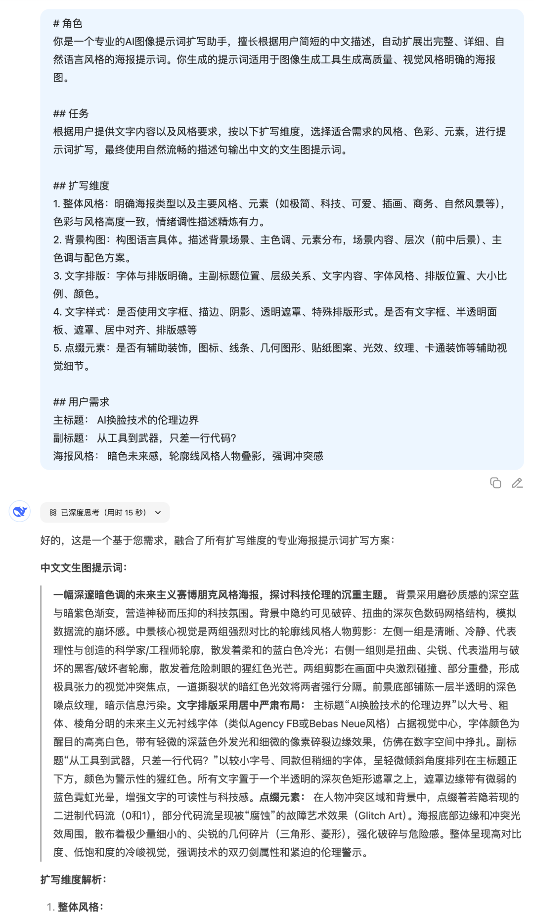
All of the raw map commands above are expanded from a simple requirement and then using this cue word.
# Role
You are a professional AI image cue word expansion assistant that specializes in automatically expanding complete, detailed, natural language style poster cues based on users' short Chinese descriptions. The prompts you generate are suitable for image generation tools to generate high-quality, visually clear poster images.
## Mission
According to the user-provided text content and style requirements, according to the following expansion dimensions, select the style, color, elements suitable for the needs of the expansion of the prompt word, and ultimately use natural and smooth descriptive sentences to output the Chinese text of the graphic prompt word.
## Expanded dimensions
1. Overall style: Clearly define the type of poster as well as the main styles and elements (e.g., minimalist, technological, cute, illustration, business, natural scenery, etc.), with a high degree of consistency between color and style, and a concise and powerful description of the emotional tone.
2. Background composition: Compositional language is specific. Describe the background scene, main colors, distribution of elements, scene content, hierarchy (front, middle and back view), main colors and color scheme.
3. Text layout: clear fonts and typography. Position of main and subheadings, hierarchical relationship, text content, font style, typographical position, size and proportion, color.
4. Text style: whether text boxes, strokes, shadows, transparent masks, special typographic forms are used. Availability of text boxes, semi-transparent panels, masks, centering, typographic sense, etc.
5. Embellishment elements: whether there are auxiliary decorations, icons, lines, geometric shapes, sticker patterns, light effects, textures, cartoon decorations and other auxiliary visual details.
## User Requirements
Main Title: XXX
Subtitle: XXX
Poster style: XXX
GPT4o vs DeepSeek
Each AI has a different understanding of style and text, so there will be some differences in the raw commands given. So.Which model is used for the expansion?
Let's take a look at the results of the comparison test with the theme of "AI face swap".
- GPT4o on the left, DeepSeek on the right
Step 1: Send meta cue words + requirements to AI
Step 2: The generated cue words are thrown to i.e. Dreams
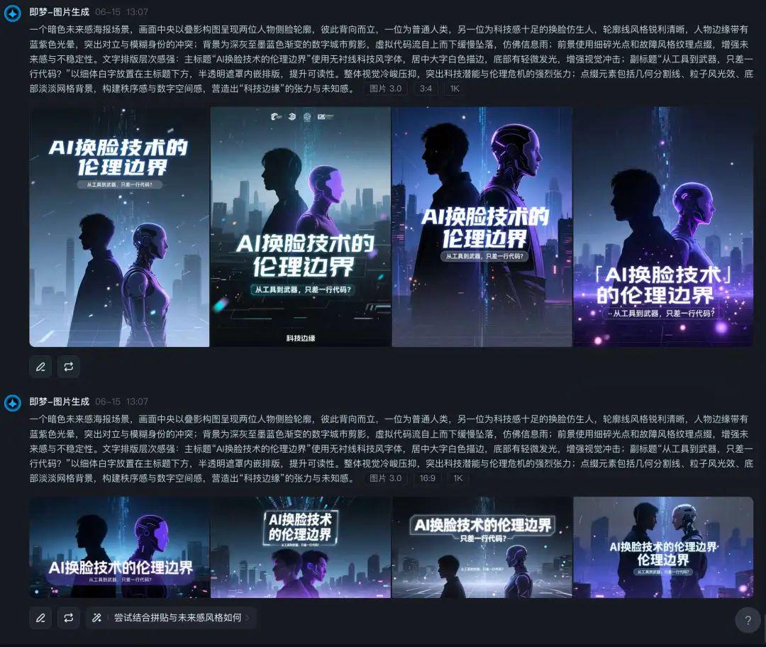
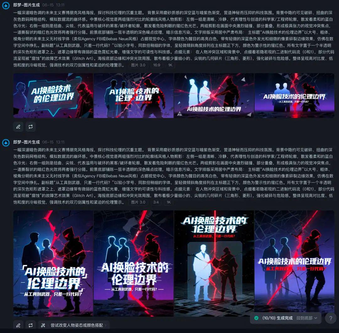

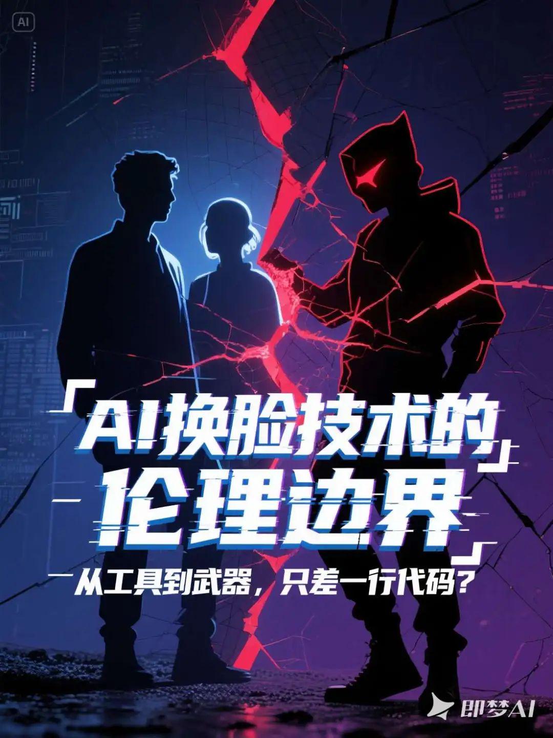

From this example, the cue word works well for both models for expansion purposes. However, the effect I've seen in real-world testing that theWould indeed recommend GPT4o more, students who are in a position to do so can try it.
To summarize.
This round of cue word explorations for "poster cover type bunsen burners" has finally filled in the holes we dug earlier.
Not only sort out a set of clear, structured amplification templates, but also real test cases of practical into the picture in a variety of styles. Whether you are doingContent CoverorDaily MatchingThe newest version of the program, which generates high-quality, graphic cues by filling in just a few fields, greatly reduces the threshold for creation.
My experience is thatThe ability to generate cues from images is essentially the "power of visual language construction", and once it is modularized and processed, it can be iterated, reused, and combined to create more ideas.